Category: General Scrapbooking
Articles in the General Scrapbooking category
Our theme this month as Shauna’s Shabby Shoppe is Colourful You, and this is my rendition of the theme…. a colour grouping I favour so much, I even dye my hair to match!
I had fun working with all the chipboard here. For something a little more subtle, I took the Fancy Pants chipboard and cut down the photo corner into two pieces, along the interior line. The corner bit I used at the top of the photo, while the left over bit I used on the bottom corner of the patterned paper. :)
I’ve got two more sets of DT layouts to share over the next few days, so stay tuned. The beginning of the month is always busy when it comes to posting layouts. :)
This is a layout I did for a 30-minute challenge. You were allowed to collect your photos and supplies before hand, but then you set a timer and had thirty minutes to build the layout. I did mine in 32 mintues. I probably would have been able to do it in less if I hadn’t hauled out the sewing machine.
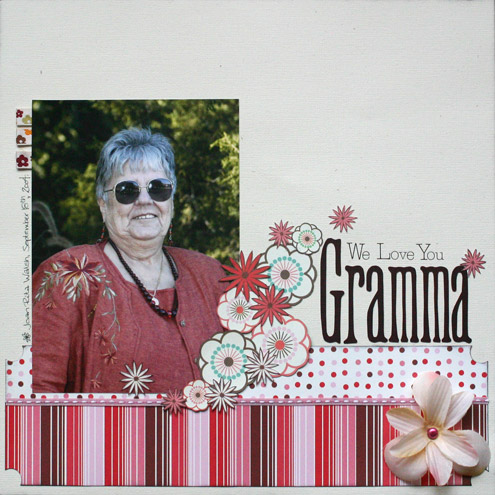
Yes, I know. It’s a rare layout I’ve done that actually depicts a person. I don’t have many photos of people and I have tons of photos of things/places, so it’s not that I choose not to scrap people, it’s just that my photos of non-people significantly outweigh people photos.
Now that the disclaimer is over, this is Gramma. She is a wonderful lady and I’m really happy to be part of her family now. The photo was actually taken at our wedding a couple of years ago. The layout itself was for a challenge on SSS that required a minimum of 16 flowers from at least 4 different sources. My 4 different sources were flowers cut from patterned paper, flower ribbon, hand-drawn flowers and a silk flower. :)
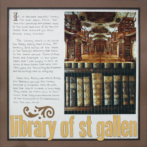
I finally got a chance to finish my layout for the memorabilia challenge done, but I was so busy chatting all weekend I didn’t get around to posting it here. So here it is… one of the most amazing libraries I’ve ever seen. And those aren’t photos, they are postcards—photography wasn’t allowed in the library. ;)
I thought I’d give everyone a break from the SEI and post something else. ;) Don’t worry, I still have a bunch of SEI layouts to upload, so you’ll be seeing more of them.
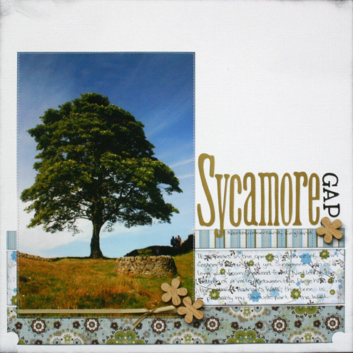
I did this layout for Margo’s DT challenge last week. (Hey, I get there eventually.) The challenge was to something wooden or wood-looking. I used the only wooden thing I had, some lil Davis wooden flowers I got from Shauna.
About the layout… Sycamore gap is along Hadrian’s Wall, just west of Housesteads. This tree is located in the narrow valley between two very steep hills, and it’s my favourite spot along the wall. Sycamore Gap was also used in the opening sequence of Kevin Costner’s film Robin Hood, even though it’s no where near Sherwood Forest.
I think I’ll be working on this week’s challenge next. ;)
Loading up a few more of my layouts using the SEI Granny’s Kitchen set. The first was done for a Challenge Anna Sigga posted on Shauna’s Shabby Shoppe which involved using a mixup of alphas/fonts. Since my little brain seems to have issues with using more that one font in a word, I used 9 different alphas over the course of the entire title, if you count the dymo strips.
This layout I just did for the heck of it. I’m slowly working my way through my photos. I’m trying to do a Granny’s Kitchen layout for each of my albums. So far I’ve done 10 layouts (some of which are still waiting to be posted), and still have TONS of SEI left. I think I might work with some different papers for a while then go through all the albums again. This is all working out rather well for me as I’m scrapping photos that I wouldn’t normally have chosen. For various reasons these papers go well with ‘less than exceptional’ photos and make them look good, while they look horrific with some of my favourite photos. Go figure. At least I’m scrapping some of these previously unloved photos. ;)
And speaking of challenges, we have started doing weekly DT challenges on the boards at Shauna’s Shabby Shoppe. It’s my turn this week, and I’ve challenge the members to use memorabilia on their layouts. If you want the full details, please check out the official thread.
I loved this building in Luzern, and if I love something I usually take photos of it. Buildings definitely rate high on the list, especially when they are intriguing, and I really love the medieval feel that this building had. I loved all the nooks and crannies, and I especially loved the spider veins under the stairwell.
I’m slowly making my way through my set of SEI. ;)


