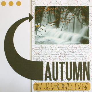
Okay, I normally don’t get that excited about finishing a layout, but this was no ordinary layout—it was white. I’m not really sure what it is about white that I don’t like, but it’s just not me. However, I’m happy about this layout… and funnily enough I may even do it again sometime!! I drew inspiration from all over the board, and knew I just needed to keep it clean and simple for it to work for me.
The paper was simple… I really didn’t have much choice on that account, which in the long run was probably for the best. It meant that I couldn’t think about it. This is all I had (but big thanks to Lynette, cause the paper was a gift from her!!). The main colours of the photo were white, brown and this beautiful golden yellow, so that’s where my colour inspiration came from.
The arrow. I really like that arrow, and it goes really well with the SEI Be-Bop paper I used, however the inspiration for that came from an article I read on ScrapJazz about using arrows in your layouts. And the three dots. I love those three dots, and many of my favourite scrappers use that same technique including Cari Locken, and Carrie Owens, among others. Besides, I learned a long time ago if you are going to have accents to make sure they are an odd number. It just looks better.
Other than the SEI paper, it’s just cardstock (the brown is bazzill, the gold is worldwin) and Making Memories Heidi rub-ons (large caps). That’s it.
I’m really happy I tried my hand at this challenge, because the more I look at this layout the more I like it… although mostly because I tried something completely different and way out of my comfort zone. Thank you Flavia for posting this challenge!!!! :)
