
Category: How to...
Articles in the How to... category
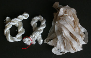
I love dyeing. It’s something I’ve spent many long hours doing, but I don’t have my dyeing equipment with me currently. I wasn’t going to let that stop me from making some customs threads. I started with a few different skeins of threads, including some rayon thread, silk spun and cotton ribbon yarn and used Ranger’s Adirondack ColourWash. I’ve been having a lot of fun with this product ever since I bought it in late summer, it is just so versatile. However, be sure to wear gloves while working with the dye.
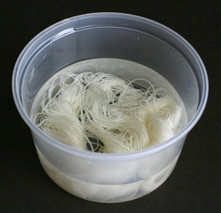
To start, I soaked all my threads. I like to unwind them a bit, just because I paranoid about having white bits left over that haven’t dyed. I usually just use tap water, but if you have hard water you may wish to considered using distilled water, and fill a container with the water, immerse the threads, and let them soak for a couple hours (minimum 30 to 40 minutes). Everything seems to dye better if it’s had a good length of time to soak in water first. I’ve used old salsa and dip containers for this because they are a nice size, but any type of container would work although I personally prefer clear containers so I can see through them.
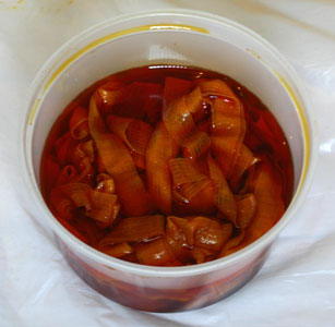
When the fibres have finished soaking, it’s time to create a dye bath. In a separate container, mix some of your ColourWash with a bit of water (if desired). The greater the ratio of dye, the darker the colour will be — straight dye will produce the colour on the package, where as 10 squirts to 1/3 cup of water gave me a lovely light (not pastel) shade. Stir the dye bath. Remove the fibre from the water bath, and give it a gentle squeeze to remove the excess water, and put your fibres in the dye bath, and gently stir. I kept my fibre in the dye bath for a couple of hours, mixing it around occasionally.
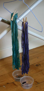
Gently squeeze out a bit of the excess dye and hang your fibre up to dry. I used a clothespeg attached to a hanger and hung them off the ironing board because that was what was handy. Be sure to put something under the fibre to catch the drips. The drying time will vary according to weather conditions, and type and amount of fibre, but I generally leave it at least a good day.
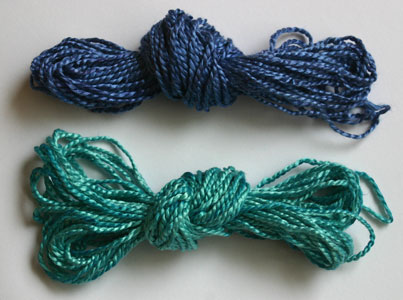
To fix your colour, you can either iron it, use a heat gun on it, or heat it in the cooker, however be aware of the melting point for the particular fibre you are using. Personally I like using the iron. You’ll need to iron you fibres at their correct setting for several minutes. Once the fibre has been heat set, wash the fibre out in water to get rid of any excess dye — I personally like using a little bit of shampoo in the water, but soap/shampoo something that is optional, just make sure that the fibres get well washed. Hang them to dry, and once dried they are ready to use.
I like using the ColourWash dyes because they come in a range of wonderful colours, which can be diluted to produce tints, or combined to create even more colours. They are also so easy to use. If you are dyeing just a small amount of thread, such as to use on a paperarts project, you can simply spray the threads with the colour wash, dry, heat set and wash, but for anything more than a couple of yards, I find the above method works quite well, and I will often dye several colours at once.
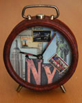
I love getting really cool papers in the post, and when I received the Tim Holtz papers by Design Originals as part of my sponsor package for Scrap That Moment I frantically searched through my alterables closet. (Yes, I have a closet full of stuff to alter… and no, I don’t have a problem with that. My husband does, but I don’t.) The result—a retro alarm clock.
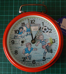
I found this little clock in one of the charity shops a few months ago. I went out specifically looking for clocks for an assemblage challenge project, but things got out of hand and I never was able to start, let alone finish, the project for the challenge. I really liked the clock for several reasons—it had a simple shape, it worked, and I love how the footballer’s leg kicked back and forth with the ticking of the seconds. It was the movable leg that sold the clock for me…. although at £1.49, it wasn’t much of a sell.
What you’ll need to make your own clock (or similar altered object):
- A clock
- Some Decorative paper or cardstock and embellishments (I used the Tim Holtz papers and Doo-Dads by Design Originals )
- An ink pad for distressing (I used Tim Holtz Distress Inks by Ranger in ‘Old Paper’)
- Your favourite paper adhesive (I used double sided tape)
- Tissue paper (preferably bleedproof, but it’s not necessary)
- Modge Podge (or PVA glue)
- A marker—optional. (I used Sakura Permapaque)
- A paintbrush, scissors and a sharp knife
First things, first. You will need to disassemble your clock. You will also need to remember how you disassembled your clock so you can reassemble the piece when it’s done. For most clocks, it will simply be a matter of removing the bits that wind the clock up, taking off the feet and popping the back off. If for any reason your clock is more complicated, take a few digital photos while you take it apart so you remember how it goes back together. Keep all your small bits in a grip-lock bag or a small box to avoid losing them, and only take off the bits that are necessary in order to remove the face of the clock from the exterior body.
Once the main body of the clock was removed from the rim, I removed the movable foot piece and the small alarm hand, both of which just popped off. The main hands of the clock were well engineered into the piece, so I left them alone.
And now the fun bit—decorating. :)
I placed the clock piece face down on the decorative paper I was using as a background, traced around it, marked the centre and cut a hole for the hand movement. I also then cut a line from the edge of the background paper to the centre to allow me to get the background paper on the face without removing the hands of the clock. Mark and make holes for the smaller hands, if applicable.
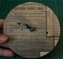
If your design has an obvious up or down, be sure the top of the design rests at the 12 o’clock position, and glue the piece into place. Once glued down, the cut line is hard to see, however try to place the cut where it will be hidden by other papers or embellishments. This may require a bit of extra pre-planning if you aren’t adding many extra bits to your clock. (Note: the background paper I used is called ‘Railroad’)
Choose your elements that will go on the face, in this case I took postcards off the ‘New York’ paper, the letters N and Y from the ‘Print Blocks’ paper and Doo-Dads off the ‘Postage’ sheet. Cut them out to size, ink the edges with distress ink and glue them to the clock face. Be aware that on most alarm clocks the outer 1/4-inch will be covered up by the interior rim, so make sure that everything fits within the viewable space. You can always place the rim over the face to double check that everything is in the right position before firming everything into place. Once glued down, you’ll be able to trim off the excess around the edges with a pair of scissors.
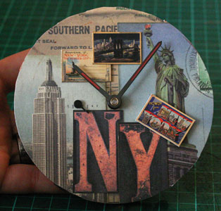
I reattached both the hand for the alarm (on the left side), and the little footballer’s leg (on the right-hand side). I then covered the leg up with a postcard Doo-Dad, sticking it into place with a bit of double-sided tape, ensuring it had enough room to move without hitting the rim of the clock.
As a final touch to the face, I used a brown marker to fill in the glow in the dark strips on the clock hands. Call me strange, but I didn’t feel as if the glowing green was all that harmonious with the vintage feel of the rest of the clock, but if your clock will be used in a bedroom you may wish to keep this glow in the dark feature.
And now the messy bit—decorating the body of the clock.
For this exercise, be sure you are working on a surface that is easy to wipe up, as the Modge Podge will get all over your work surface, and if you can’t find bleedproof tissue the colour of the tissue will also get all over your work surface. If all else fails, lie a large bin bag across your table to protect it.
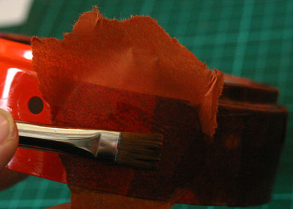
To begin, tear your tissue into small pieces, about 1 to 2-inches square(ish). These pieces don’t have to be precise, they just need to be a workable size with no cut edges. Paint a bit of the Modge Podge onto the body, cover it with a piece of tissue, and paint more Modge Podge over the top to glue it down. On the edges of the piece, simply fold the tissue over the edge and glue it to the inside (this will help keep the tissue in place while it dries). Continue glueing down bits of tissue in this manner until you’ve covered the entire piece with a couple layers of tissue. You’ll need to do this to the body, the interior rim, the back, and the footplate (if your clock has a footplate… mine did). Don’t worry about avoiding the holes for the feet and such, just tissue right over them, then poke through the holes with a pencil. You can always use a little Modge Podge on the back side to seal them into place.
Once your pieces are dry, you’ll need to cut away any tissue on the interior of the body and the interior rim of the back piece where they slip into to one another. This is usually a pretty tight fit on most clocks, so it won’t accomodate the extra tissue. On the body, run a sharp knife around the inside to cut away the excess tissue. On the back piece, score a line under the lip of the back and you should be able to peel the tissue away quite easily.
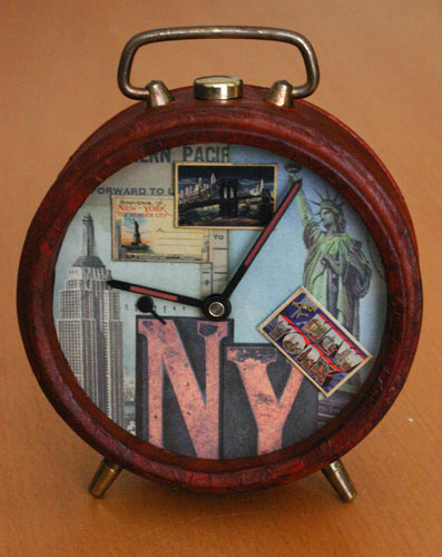
Now it’s time to reassemble your clock. Be sure to clean the glass of the clock before putting it back together to ensure you don’t have any tissue, glue or fingerprints trapped inside. Once all the bits are back on the clock, wind the piece up and enjoy your work.
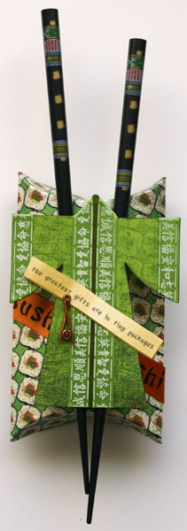
I had quite a lot of fun making this little gift box, and thought I would share it with you, including a downloadable template and instructions.
Ingredients:
- a variety of oriental-influenced papers (I used Far & Away )
- 1/4-inch and 5/8-inch ribbon (I used Far & Away )
- accents (I used Far & Away )
- template, downloadable in .pdf format here—JapGiftBox.pdf
- 150lb white cardstock
- Chalk or ink (I used Tim Holtz’s distress ink in ‘old paper’ and ‘black soot’)
- Chopsticks
- Double sided tape (I highly recommend Therm o web’s Strong Tape )
- Optional: Notch tool or 1/2-inch circle punch
You may wish to check out your local Asian markets, as many have wonderful elements such as coins and chopsticks for sale which make great additions to a favour box or other altered project.
Instructions
First, download and print out the template onto the white cardstock that I listed in the ingredients.
To make the Kimono:
1. Cut out the kimono template.
2. Glue the template to the reverse side of your pattern paper, and cut it out around the template. Repeat to cover the other side.
3. Decide which side of your kimono is up, and on that side draw a light pencil line vertically down the centre of the kimono and chalk or ink for about 1/8-inch on either side of that line. This will create a shadow that will add depth the kimono to give it a ‘faux’ inside. (I inked mine with my ‘old paper’ ink pad.)
4. Ink or chalk the edges of your kimono (I inked mine in black).
5. Run ribbon along either side of the centre line using the neck piece as a guide, leaving approximately an 1/8-inch gap (the triangular neck piece gives the illusion of a collar and keeps the ribbon taut).
6. Run your ribbon along the outside edge of the sleeves to finish off the edges. For my kimono I only used ribbon on the front side of the piece.
7. Set aside.
To make the box:
1. Cut out the box template and adhere the blank side of the template to the reverse side of the patterned paper. Trim the paper using the template as your guide.
2. Using an embossing stylus or a dried out ball point pen, trace along the dotted lines of the template (template is facing up, patterned paper is facing down).
3. Crease the lines you’ve just created as much as possible.
4. If you wish, you can use a 1/2-inch circle punch or a notch tool to cut out at the centre edge of each of the curved lines. It gives a lovely finished look and makes the box easier to open.
5. Ink all the edges of your box.
6. To assemble the box, lay down some double sided tape along the long small flap (the right-hand side of the template) on the patterned paper side.
7. Fold the box in half (along the crease line) and line up the edge of the box so that the flap lies to the inside of the box. Once you are happy with the placement, stick the flap in place securely.
8. Squish in the creased edges of the box to curve out the front and back panels and then fold the ends of the box in to close you gift box.
To assemble the piece:
1. To start, I taped the 5/8-inch ribbon diagonally toward the bottom of the box.
2. To add the chopsticks, I first marked where I wanted the chopsticks to lie and then used double sided tape wherever they touched the box.
3. Glue the kimono to the chopsticks in the same manner.
4. The Chinese fortune rub-on was rubbed onto a scrap piece of white cardstock, and then cut out. I lightly inked the edged with my ‘old paper’ ink pad. I used double sided tape to adhere the fortune and liquid glue to adhere the charm.
The kimono measures appoximate 3×4-inches. The finished box measures about 2.75×5 x 1-inch. Now you just need to fill your gift box with a small gift, vouchers or money and give it to someone special :)
The ‘Fine Print’: The Japanese-Style gift box piece was created for www.scrapthatmoment.com however the images, instructions and templates are copyrighted to me, Chriss Coleman. Feel free to use these templates and instructions for personal use. Please don’t post to .pdf and instruction to any online forums, however feel free to link folks back to this article. If you post your creations online, a mention or a link back to www.sheepspace.ca would be much appreciated…. it’s all just good karma. :)
Also, feel free to leave a comment with a link back to your creation. I’d love to see it. :)
This is the coolest site that I just NEED to pass along. In fact it’s several sites. :)
Creative Collage is run by Kelly Angard. In her blog she offers up some great tips and techniques that can be used in scrapbooking, cardmaking, ATCs and altered books… in fact altered anything for that matter. Each Tuesday she posts a new technique to the site dealing with the art of collage, with a modern twist. While you are there, check out the archives. Lots of great ideas hiding in there!
If you like Creative Collage be sure to check out Kelly’s other site, The Crafty-Girl™. Lots of inspiration of altered books here, among other crafts!!
Speaking of altered books, there are a couple great Yahoo! sites dedicated to this subject my favourite of which is AlteredBooks. This group has two other sister sites, names AlteredBookScans (which is used to library the many, many fab AB scans of the main list, and AlteredBookArchives which houses the archives. Lots of tip, ideas, and techniques in these groups, not to mention about 8600 members strong.
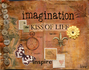
Hopefully some of these sites will give you some ideas and inspirations for your own creations. I’ll be adding each of these sites to the side bar links as well, for easy reference. The AB spread shown as part of this article is one I did ages ago (or at least it seems like it) when I was experimenting with glazing techniques. Must do some more soon. Maybe it should be a New Year’s resolution. :)
There were some articles recently published on ScrapJazz which focused on the basics of photographing your layouts. I thought I’d share them here.
Denise Gormish wrote the first back in April which dealt with the basics of photographing a layout and then followed up with some more advanced techniques earlier this month. She has some great tips in there, and they are well worth a read.
I would also like to add a few more for those who have access to PhotoShop or PhotoShopElements, both available from Adobe or any other digital imaging program with a Skew function.
First, Denise suggest adding some white or black to the layout (which she suggests you can later edit out). The premise is something to which I would wholeheartedly agree, and in fact do myself. I simply take a white envelope, and place it beside my layout. By adding something white, it is easy to go in and fix any colour casts at the touch of a button, especially useful since I photograph my layouts indoors.
After I have colour corrected my layout, I crop my layout to 12 by 12-inches, getting as close to the edges as possible, but without cutting off any of the layout.
Next, go to Image—> Transform—> Skew. (It’ll pop up a window about a new background layer, just enter through that… technically, you can create a new background layer first, but I’m too lazy to bother, especially when the program will do it for me with a couple touches of the enter key.) Now simply drag the corners of the layout to meet the edges of your crop until you no longer see any background. Voila! A perfect 12×12 layout without any background.
Now you’ll need to flatten the layers (under Layers—> Flatten Layers), and resize and save your layout as needed.
The Skew function is very useful if you can’t get perfectly perpendicular to your layout (for instance, I lay mine on the coffee table, and get it ‘as close as possible’ knowing I can fix any coverging verticals with the Skew function).
If you have a two page layout, just take two photographs, edit each separately, and stitch them together. :)
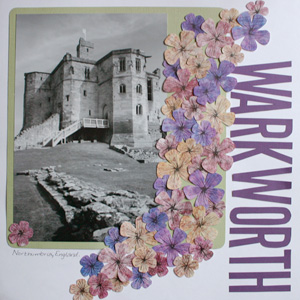
No. Actually I don’t have any primas. They are on the list, but I never seem to get around to buying any, or the e-shops I frequent don’t have the colours or sizes I want.
My solution? Make my own, of course. :)
This was a sponsor layout for Murdock Country Creations. I took their 3 colours of their polished stone paper, sanded them down, cut them out into 2 different sized flower shapes, penned in the centre with my trusty journalling pen, and voila! We have flowers.
This is the second time I’ve made my own flowers, in some manner. I’ve also made them out of chipboard. And I don’t think I’m done yet. What can I say?? I think I may be addicted to flowers, or at least to making them!
If you would like to see some of the other layouts the DT did with Murdock Country Creatios paper, check out their sponsor gallery.
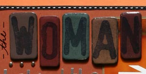
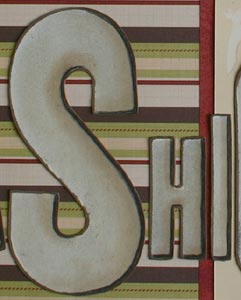
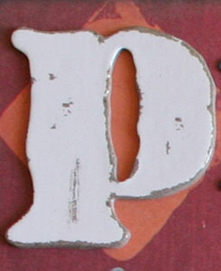
I recently posted an entry on how to make chipboard embellishments, and I think since that day making my own chipboard embellishments has become my new favourite thing (although i must admit they do look ‘richer’ IRL).
This is how I did my chipboard letters: I used Daler Rowney Grey Board, and cut it so the shape and size I wanted using my craft knife. I then rounded the corners with some scissors, and sanded all the edges with some fine grit sandpaper. I then applied a dark coat of acrylic paint. Once the paint was dry I painted over it with a slightly ligher colour of paint, and once that coat was dry I sanded the face again to give it a distressed look before stamping my letters (stamps are Ma Vinci’s Area 51, and are stamped with a black ink pad). After the ink dried, I coated the entire thing in Anita’s 3-D clear gloss finish for liquid embossing, and allowed it to dry over night before attaching them to my layout. This was so much fun, and I can’t wait to see what else I can come up with!!!
Since my last entry on chipboard embellishments, Allyson Bright has published a new article on ScrapJazz.com on how to take your chipboard embellishments to the next level. It’s well worth a read!
I hope these articles give you the incentive to try your hand at making your own chipboard embellishments. It’s so easy and fun to do!
With the advent of die cut machines and computer titles, the use of hand cut lettering isn’t as prominent as years past, however, I think they still have there place. They simply have a classic look, and can be done in any type of font you wish, and I would like to share a few tips I have learned.
- 1. Use one of those craft knives with the break-off blades. They are made by a variety of companies, and are much the same, however I do like the kind that has a lock on the blade so that it doesn’t accidentally move while you are cutting. You can use an x-acto or scalpel, but I like how easy it is to simply break off a blade when I need a sharper edge.
- 2. Always use a sharp blade. I will often break the blade tip off after about 6 letters if I’m cutting paper, or about 3 letters if I’m cutting cardstock. The sharper you blade is, the better the cut, the easier it is to cut, and the less likely you are to cut yourself. On the latter note, the duller the blade the harder you will need to press and so therefore if you accidentally slip while cutting you will most likely injure yourself worse than if the blade had been sharp.
- 3. Use a glass cutting mat. I simply use piece of glass from a cheap photo frame I bought at Ikea, but any piece of glass will do. I find that it is easier to cut (especially on curves) if I’m cutting on glass, and that my blade stays sharper than if I were to use a self-healing mat. I used a self-healing mat for years, but the instant I tried using a glass mat I never went back.
- 4. Use your own handwriting or a computer font. Using your own handwriting is always fun, and Carrie Owens posted a wonderful example of how she does her beautiful hand-cute block letters. If you wish to use computer fonts, there are two ways to go about this. First is to print directly onto the paper or cardstock you are cutting. You’ll need to Mirror Image (reverse) your text horizontally in whatever word processor you are using, and then print on the backside of the paper/cardstock, this way you’ll be able to simply cut around the letters, but the ink doesn’t show on the right side of the paper. If you don’t want to print directly on the cardstock (for instance, if it’s too think to go through the printer), then print out your letters onto regular paper, and then place your printed sheet over your cardstock with a sheet of graphite paper in between. Trace the letters, then cut them. I recommend graphite paper because it isn’t as messy as carbon paper, and the lines can easily be erased with a good rubber.
- 5. Use rubber or foam stamps. This is one of my favourite things to do. I simply stamp out my title on a piece of cardstock, then cut them out leaving a little border of the cardstock showing. This technique really allows the letters to ‘pop’ off of the page
I hope these tips will encourage you to try hand cut letters, or even try them again.
I love chipboard embellishments. I have two sets of ‘Lil Davis Chipboard Letters, which I love to use, and I’d still like to get my hands on the various chipboard alphabets by Making Memories and Heidi Swapp. I like the idea of taking the raw chipboard letters and painting and sanding them to suit my layout.
However less intricate chipboard embellishments are easy to make yourself—and Allyson Bight’s article shows you how! I can think of lots of shapes I’d love to make, including flowers, bookplates, and tags for starters.
Now going a step beyond this, you can make your own chipboard alphabets. Scraptivity’s article details how to make chipboard alphabets, similar in theme to others on the market. What I love about this idea, is that I can use the plethora of alphabet stamps I already own, and co-ordinate the stamping on both the layout and chipboard!
A couple of additional things of note. First, they mention where to find chipboard, and they give some great ideas, but I’d also offer up the suggestion of trying Grey Board by Daler Rowney from your local art supply shop (it will most likely be in with the mount boards). It comes in A1 sheets (about 60×84cm or 23×33 inches or so), is pH neutral, inexpensive (about £1.40 or so in the UK) and it the same thickness as most of the chipboard stuff on the market (about 2mm thick). This will be a little harder to cut than thinner chipboard, but for basic shapes it shouldn’t be a problem if you use a Stanley knife, and this will give you a nice lumpy embellishment for your pages—- just like the real thing!
In the articles, they mention using UTEE (ultra thick embossing powder) to add a finish, however other options would be liquid embossing (such as Anita’s 3-D clear gloss finish or Diamond Glaze) or using a paint-on or spray-on acrylic varnish (available at most arts or crafts shops—- just make sure it is acrylic, and not ketone based!).
I can’t wait to start creating my own chipboard embellishments!!!