
We headed out to meet up with some old work chums of mine and on the way back, I spotted this well near the bus stop, so naturally I took a photo.
I was playing around in Photoshop and decided to try a sepia version. I can’t decide which I like better. Opinions?
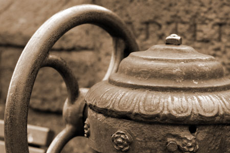
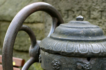
I have to admit I don’t use many Photoshop tools other than crop and levels to adjust my photos, but sometimes I just need to play a bit. ;)
Comments
I like them both, but I’m partial to the sepia tone… it’s warmer. The bluish one? It looks like cold metal. (Which maybe what you were going for! In that case, excellent work!) :-)
I think I like the sepia tone as well. It makes it look more timeless.