Category: General Scrapbooking
Articles in the General Scrapbooking category
If you’ve followed my thoughts for the last several months (which would be a challenge since even I can’t follow them in any cohesive manner), you’ll know I’ve done a lot of thinking about changing up my sizes a bit.
I started out as a 12×12 scrapper. I love 12×12, but I’ve been wanting to do something a little different lately and was seriously considering doing some A4 layouts (a little taller and skinner than 8.5×11inches, but roughly the same) but I’ve been putting it off because all my albums have been started in 12×12.
Well, I’m not putting it off anymore. I’ve done my first A4 layout, and I’m quite happy with the size. As for putting them in albums, I’ll just squeeze them in somehow. A few thoughts as to how I may possible to this:
- Paste the layout onto a 12×12 piece of cardstock, and simply slip that into the page protector
- Use A4 page protectors in the 12×12 album
- Use existing 12×12 page protectors by sewing them to an A4 size, and cutting off the excess.
No matter what I choose, I’m not worrying about it. It’s a nice freedom. AND I was able to get some photos scrapped that I simply could wrap my head around for 12×12. That makes me happy.
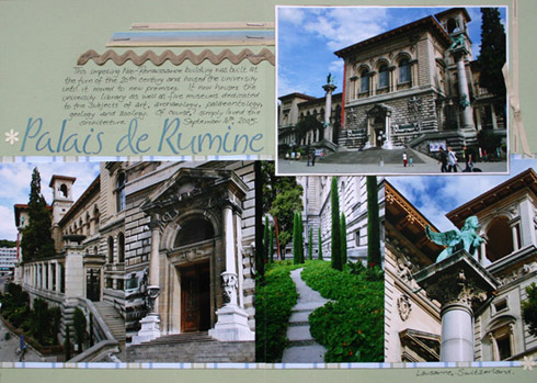
Wonder if anybody will notice? Possibly. Here’s the first of many—it’s a double page spread of Palais de Rumine in Lausanne, Switzerland:
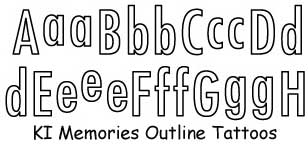
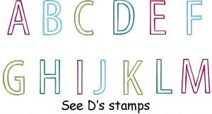
If you are like me and love the look of KI Memories Outline Tatooes, then you’ll like this discovery. See D’s Open Face Alphabet Set by Sugarloaf uses a very similar font. Albeit, the stamps are only uppercase, but I love the stamps (mostly for the re-usability factor) so I was really pleased when I discovered the two packages sitting next to each other on my desk, looking like long lost twins. This is now my favourite set of See D’s. :)
On other notes, I’m at home scrapping today. I am happy. It’s my first day off in over a week, and I so need the break. Most of the stuff I’m working on I can’t post yet, but I’m gonna try to squeeze in a few layouts just for me. :)
If you ever wanted some ideas on how to use chalks on your layouts, you may wish to check out Scrap That Moment today, as the Design Team is loading up their Craf T layouts today in the Craf T sponsor gallery
I’ve really enjoyed the holidays this year, mostly due the visit of my cousin. It was absolutely lovely being able to spend lots of quality time with her. I think she’s even interested in starting to scrapbook—she devoured every magazine and idea book I had on hand. I was sad to see her leave this morning.
We did have a great time, travelling around the countryside together, and I have a lot of photos to sort through as a result. I’m quite excited to have some of them printed and I already have layout ideas milling about in my head. I think even a mini-album may be in store. :)
I know it’s a week late, but I thought I’d share some of my scrapping resolutions for the year. I love working towards goals, so here they are:
- 20 pages a month, or at least 200 pages for the year.
- I’d like to complete at least 4 mini albums.
- At least one completed album.
Wish me luck.
The talk about this site is everywhere. Big Picture Scrapbooking is the latest ‘big thing’ for scrapbookers on the web. It’s mission is to get you to think a bit more out of the box in terms of scrapbooking and to celebrate life through your scrapbooks. Registration has already begun for the online classes which are being taught by Donna Downey, Cathy Zielske, Beth Proudfoot and Stacy Julian.
To get people to see what the site and the classes were about, they offered a Free Class in which the project was to create a scrapbook tin. I downloaded the project a couple of weeks ago. Now I just need to select (or take) some photos, edit and send them to the lab for printing. Somedays I believe that not having a home printer requires me to have to plan too much. Anyway, I’m hoping my trip to London this week will provide me with a few good photo ops, so I’ve been putting off making this project. I’m thinking that it may be one of the first projects I work on in the new year.
And no, I have no affiliation with them. I just think it’s a cool project, and besides, I have a few “Altoids” tins that I’ve been hanging onto for a rainy day. ;)
In my strive to do some simpler layouts, and to experiment with white space, I decided to do a few scraplifts. I simply browsed through my BOS at 2 peas and chose 3 random layouts that I loved and used white space well. After starting on the second one, I realized all three were done by the same scrapper.
Meet Jennifer Johner. This chick is awesome! I love, love, love her work. I love how she sews on her layouts. I love her designs. I love how she’s a 12×12 scrapper. :)
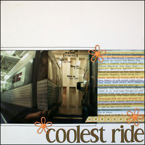
So for my first completely blatant scraplift, we have Coolest Ride which is lifted off Jennifer’s Gymnastics layout. My layout is about the really neat experience we had when we were on the train from Copenhagen to Hamburg, particularly when our train boarded a boat. So cool.
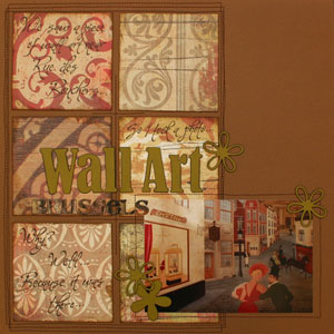
My second layout Wall Art is lifted from her Explore layout. The journalling is a bit hard to read, but since it’s completely unimportant for this layout, I decided to make it look as if it was kinda part of the paper. I think that worked.

Swiss Bears is lifted from Jennifer’s You are my sunshine. I usually have issues putting ‘distressed’ paper with clean cardstock. I’ve decided now that it’s OK. I mean, I see other people do it all the time, it just didn’t seem right to me—until now. On this layout I was also experiment with some new handwriting styles. I love this one. I think this will make an appearance on many more layouts in the future. :)
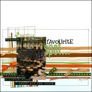
I didn’t stop there, though. I was having so much fun with Jennifer’s layouts, I decided to do one more. I fell in love with her Water Bug layout as soon as I saw it. My take Favourite Spot is about a little place in Münich that I simply adore. I think it’s now my favourite layout.
Talk about inspiration. I’m filled with ideas and inspirations, and I just can’t wait to scrap. Now that I’ve done some layouts with white space, I’m ready to tackle it in my own designs.
Thank you Jennifer!!!
In the last few days I’ve learned:
- White space is good.
- White space does not mean you are too lazy to fill it.
- I must sew on layouts more often. Much more often.
- 6×4 photos can live alone on a 12×12 layout. And they can do it well.
- White space is good.
- I love clean and simple scrapbooking.
- I love ink
- Okay, maybe I don’t actually ‘get’ the clean part. Let’s call it inky and simple scrapbooking. With sewing.
- I need more cardstock
- I love white. Well… at least when it comes to my scrapbooks.
- I can’t wait for Cathy Z’s next book to come out. And yes, she’s currently working on it. See.
- The large stack of photos sitting beside me is not an indication of how far behind I am, but rather a library of creative inspirations.
- I will never be ‘caught up’, and I’m completely fine with that.
- My scalpel is my friend.
- I am a 12×12 scrapper. No matter how much I love the look of 8.5×11, there just isn’t enough space.
- I love ribbon. Need more ribbon.
- White space is good. :)
I have to say, I’m not an idea book junkie. Since I can only buy idea books online, it’s rare for me to buy them. What can I say? I love to flip through books before I shell out £15 each, and you just can’t do that when you buy online.
I’ve been feeling the urge to experiment lately. I want to change up my style a bit. I want to play. I want to be inspired.
After hearing all the great reviews on Cathy Zielske’s book Clean and Simple Scrapbooking for the last year, the fact that I love Cathy’s blog, and the love I have for clean and simple layouts, I finally decided to order the book. Of course to get free P&P I also grabbed Ali Edwards’ book A Designer’s Eye for Scrapbooking :)
One question: why didn’t I buy these books a YEAR ago?!?
I’m feeling completely inspired. To be honest, I haven’t really learned anything new. But that’s not the point. I feel the need to scrap, and scrap in a different way than usual. They’ve made me think, and made me stretch my legs and take a step out of my box. They’ve made me realize that I really need to buy more cardstock. Especially white. Loving that white cardstock. :)
So while I’m feeling inspired, and still getting my feet wet in a new-to-me style of scrapbooking, I’m having a play at lifting a few layouts of some of my favourite scrapbook designers that fit this style. For me, doing a few lifts is the best way to learn—kinda like training wheels for scrapbooks. More on that to follow as soon as I get around to photographing those lifts. But most importantly, I’m having FUN!
Right now, I gotta scrap. And stalk the UK shops for Stacy Julian’s new book The Big Picture because after hearing the fab reviews on that book, I’m not waiting a year to buy it. ;)
What a busy time of year! Trying to sort everything out for holiday preperations, sort my backlog of digital photos (I’ve cleared nearly 12GB so far!), and trying to find some time to scrap. Oh well, at least my Christmas shopping is done. :)
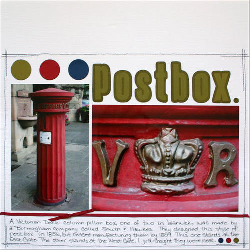
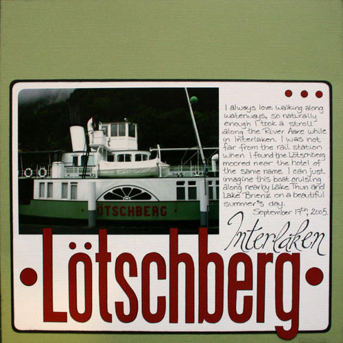
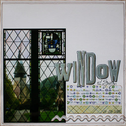
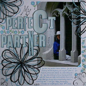
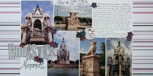
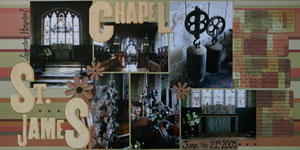
In the meantime, I just wanted to mention that the DT at Scrap That Moment recently uploaded their Sakura sponsor. We had lots of fun pens to work with, including the new Souffle pens, Permapaques, Glaze, and Stardust pens. Lots of fun. Along with some cards and altered jars, I did these three layouts. To see what the rest of the team did, check out Sakura’s sponsor gallery
Just thought I’d share. :)

