Category: Fabric Journals
Articles in the Fabric Journals category
It’s our last round, and I’m eagerly awaiting all the books to make it home. The final round led me to work in Connie’s book in the theme of mythology. I was really unsure about what I wanted to do at first, but this is what I came up with.
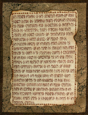
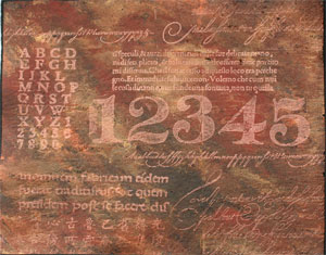
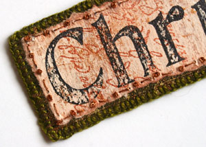
The first page I wanted to drawn on the link between Norse mythology and the Futhark script. The basis of the design is the Codex Runicus but written in Elder Futhark. The writing itself actually recounts a short history of the Futhark.
I had a lot of fun with this page. The parchment part was made using watercolour paper that had been given a wash of Vandyke Brown, and a layer of auburn watercolour crayons. Once dry, I burnt the edges with a match (then soaked the edges to ensure the edges had actually stopped burning) and layed down the text. The text itself is written using a cheap hooded fountain pen with our new FPN Galileo Manuscript Brown ink from the Fountain Pen Network (there are perks to have a husband who collects and restores founatin pens).
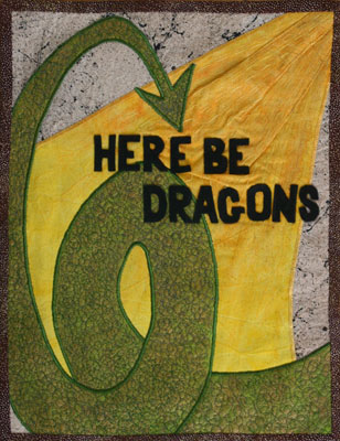
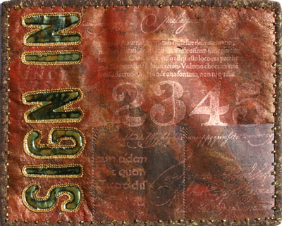
The second page I wanted to bring in a mythological creature but I didn’t want to get to detailed otherwise Connie would never get her book back before Christmas. I decided to streamline the entire thing and only include the dragon’s tail and a breath of fire. The icing on the cake came when we were discussing my husbands lack of (broad) knowledge when it comes to English geography. He said he knew everything he needed to know and drew in the air the outline of Britain and stated ‘England’. Then he scribbled around the island and stated ‘Here be dragons’. It was simply too perfect. :)
I textured the dragon with a bit of free-motion embroidery, added some running stitches to the fire to give it direction, and added the felt letters.
All the fabrics for these pages were made from handdyed/painted muslin (calico) using a combination of tea dyeing, metallic opaque setacolour, setacolour soleil, adirondack colourwash and webbing spray.
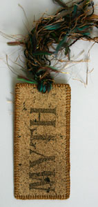
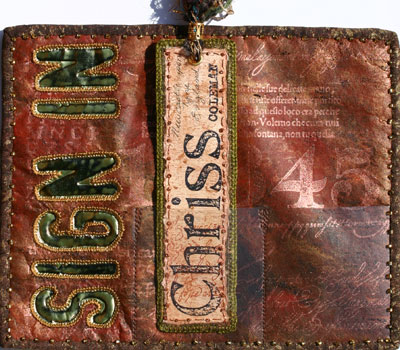
Finally, I made a sign-in tag from some of the left over bits because I thought that would tie everything together nicely. :)
I hope you like it Connie! I had fun working in your book.
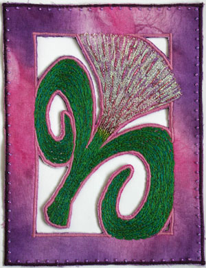
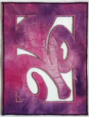
These are the pages I did for Dianne’s book in our Round Robin. She had a theme of ‘Floral Fantasy’, and had done some beautiful stitching on the covers of her book. It was also in a pink and purple theme, so I tried to keep within those parameters.
I started out by painting the fabric. I used Pebeo Setacolour Soleil, but I unfortunately did this on the dark day in history. It was nice and sunny when I started, but unfortunately the sky turned black by the time I finished painting the fabric. I pressed on, and place assorted leaves onto the fabric, and mounted a light over the fabric to help with the sun-dyeing process. What came out was really unexpected. I’m not sure whether it was something about the maple leaves, but the paints didn’t just bleach under the leaves, they actually created tiny waves of colour. I ended up really liking the result, so I plan to try it again in the future, hoping it wasn’t a fluke.
I created a floral design silhouette in much the same way I designed the cover for my own book, where I would be able to cut away parts of the fabrics. I transferred my design on the fabric and mounted the entire thing onto purple felt using bondaweb. I hand stitched the flower and leaves with a variety of threads, including ribbon thread and embroidery floss, then machine stitched over top with coordinating colours or rayon thread. I also added a few beads to the flower itself.
I mounted the back fabric onto the piece and did the edges using a zig zag stitch and all-purpose thread, and the fabric was then cut away. I usually cut first and zig zag after, but in this case I wanted the purple felt to show slightly. I finished the front edge with a few beads around the border.
I hope you like it Dianne! :)
I had the pleasure of working in Becky’s book in September, in a theme of Vintage women… and I must admit I had fun playing. :)
My biggest challenge was on how to obtain the vintage images for the book, not easy when one doesn’t own a printer. However, my mate Sue had scanned a few of our cabinet cards and printed them off on her laser printer, so I tried to transfer them onto unbleached cotton using Dylon Image Maker. The instructions state that you need to use a photocopy, but I figured since laser printers are toner-based it might work. And it did. :)
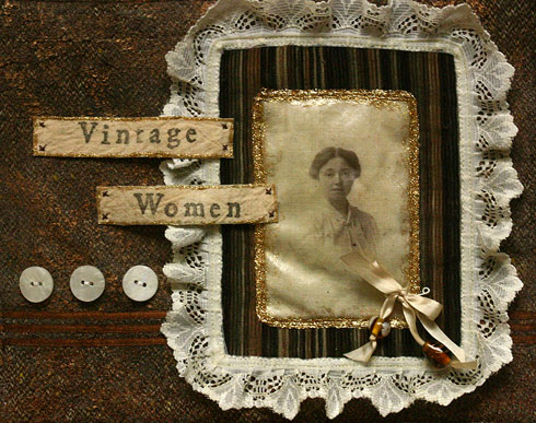
I used a brown suiting fabric as the base for both pages, with volume fleece (quilt batting) in between as per Becky’s wishes. On the first page I painted a nappy liner with Adirondack Colour Wash and fused it onto the suiting and zapped it to distress the liner. I then sponged on some metallic copper acrylic paint.
I did a bit of free motion embroidery along the bottom, and stitched down three parallel ribbons for interest. I then used a piece of printed corduroy from a pair of trousers as the frame for the photo, and stitched the corduroy and transfer down with trim. I added a bit of Pebeo Touch paint in gold glitter around the edges of the gold trim to decorate and make double sure the transfer was secured in place (love the adhesive qualities of this stuff).
The labels were some tea-dyed pieces of unbleached cotton left over from another project that were backed with fusing and stamped using Ma Vinci alphabet stamps and then edged them in Touch to prevent fraying.
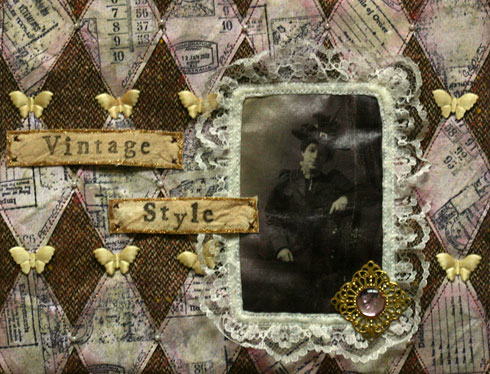
The second page is made with the same suiting. The diamonds were inspired by Beryl Taylor’s new book Mixed Media Explorations, or at least one of the designs on the cover. I’m soooo asking for this book for Christmas (hint, hint Joey!). I used a piece of 100lb watercolour paper, washed with gouache, stamped it with waterproof ink, spritzed it with Adirondack Colour Wash, washed it, crinkled it, cut it and glittered it with Craf-T glimmer chalks before sewing them down. I then added some sparkle to the suiting using auburn Glitter Touch. The photo and tags were done in the same manner as the previous page, and added a filigree and gem from Mermaid Tears to finish off the page.
I hope you like it Becky!! :)
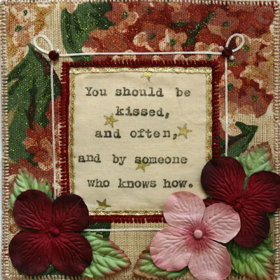
This is my page for Sylvia’s book. Her theme was Gone With the Wind quotes, and I liked this quote.
The fabric was supplied by Sylvia and I enhanced it with Pebeo Touch glitter paint to go with her cover piece. The window and edge are bound with blanket stitch, with a thin gold ribbon along the interior edge of the window. The star fabric was supplied by Sylvia, and the quote was stamped with my Ma Vinci using Fabrico stamping ink. The iron-on thread is by Kreinik and was a gift from my mate Jennifer and the flowers were a gift from Anna.
Hope you like it Sylvia! :)
I just finished off the last couple of pages of my fabric book. :)
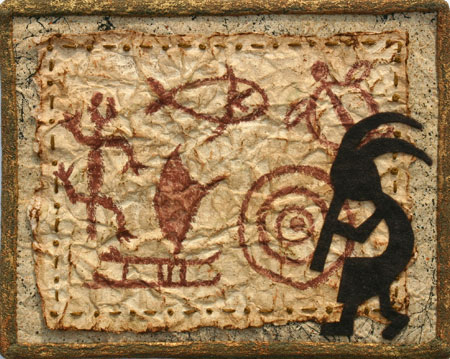
The page is based on petroglyphs, an ancient form of writing using images. The background fabric is unbleached cotton spray with black Krylon webbing spray and Adrionack colour wash dyes. The paper is 100lb watercolour paper, washed with watercolours, ink and pastels and the petroglyphs were drawn with watercolour crayons. Kokopelli is made of dark brown felt.
The entire page is bound in green loosen weave cotton/linen which was stippled with gold and copper paint, and this page backs the second of the two sign-in pages.
I’ve set up a gallery for this book, which can be found here.
My Sign-In is a two-page spread, with both pages the same except the left page has a title and 2 pockets, while the right page simply has 3 pockets.
To start, I painted some Bondaweb (paper side down) with acrylic paints (burnt umber, indian red and metallic copper) using diagonal brush strokes. Once the paint was dried, I flatten out the bondaweb (keeping the backing paper in place) and put it on a piece of black felt with the Bondaweb paper side up and began ironing the piece from the middle flattening out the fusing as I progressed to the edges.
Don’t worry about and cracks or lines that appear from the Bondaweb transfer as it only adds to the texture of the piece, however do consider the colour of the felt as it does change the effect and look of the piece as it will show through in any cracks and open areas as well as enhance the colour of the paints.
Now the fun begins. :) Using a variety of rubber stamps and a copper Brilliance inkpad, I covered both pages with stampsed images. Do becareful as you stamp as Brilliance is a pigment ink and therefore takes quite a while to dry so becareful not to smudge the stamping. For these pages I used stamps featuring latin text, french script, oriental text, numbers, and alphabets. I tried to cover nearly the entire page without overlapping the images.
Once the images are stamped, grab a heat gun and blast the entire page being sure to be constantly moving the gun. If you are using acrylic felt, as I did, it will melt under the heat gun which will create slight holes in the bondaweb. Be sure not to leave the heat gun in a single spot too long or the felt will melt through and create a hole in the page. The idea is simply to distress the paint layer, not to create lace (at least for this project) as well as to set the ink. :)
With the ink now touch dry, lay a piece of baking parchment over the piece and iron to ensure the ink is fully set. Be sure to use the parchment otherwise the Bondaweb will adhere to the iron or press cloth.
For the title I stamped on gold embossing foil with black Staz-On ink. With a spare pair of scissors (not your best set, please) cut the foil leaving a bit of a margin (about 1/8 to 3/16-inch), tacked the letters to the page with a bit of double-sided tape, and stiched around each of the letters. If you come up through the fabric and down through the metal you will find it easier to stitch and you won’t get accidental holes in the foil.
With the letters stitched, I used a fine embossing stylus and traced around the ouside of the inked edge of the stamped image as it created nice definition and depth, and generally gave a nice finishing touch.
I cut some transparency to fit, and stiched it down to the fabric, creating little pockets as I went. The stitching at the top of the pocket is reinforced with a little inverted triangle. The transparency generally goes to the edge of the page so that its edge is enclosed in the binding.
To finish off the page I backed with the previous/next page and machine basted around the entire piece. Normally I would have used Bondaweb to fuse the pages, however I was worried about discolouring the foil and messing up the painted finish somehow.
I used some lovely brown cotton eyelet to make the binding, cutting from the solid strips rather than the bits with openwork. I then stamped the entire strip with a script stamp and black Versacraft ink, over which I stamped a large bold ‘love’ stamp with copper Brilliance ink, and then stippled metallic gold setacolour over the entire thing. None of the stamping is legible, however the idea was to build up a depth of colour more than anything. Be sure to give the binding a quick blast with the heat gun to get the inks and paints to a touch-dry state, then iron (using baking parchment as a press cloth) to fix. Fold the edges into the middle or use a bias tape folder to create the binding.
After handstiching the binding to both sides, I did a quick beaded running stitch along the ditch. Always remember to knot the thread once in a while just in case the thread breaks, so that in the worst case scenario you’ll lose a few beads rather than the whole lot.
Here’s how the piece looks with my bookmark in place.
I’ve spent the last several days stitching this cover, so I’m quite pleased that it is now in finished form. While stitching I debated on how I wanted to finish my book, and I’ve decided to do it as a coptic bound style (or at least as close as I can get without having actual signatures).
I started out with a piece of natural coloured cotton fabric that has an interesting weave and tea dyed the entire piece. My plans were to do Free Motion Embroidery (FME) on the piece, but wasn’t sure how ‘full’ I was going to end up stitching it. In the end, I ended up covering the entire piece, but since I do have a few random threads apparent here and there, I’m glad I decided to do a quick dye to start. This is the before and after of the dyeing using a couple of tea bags in a couple of cups of water:
While my fabric was drying, I designed the cover. Going with my letters theme, I printed out ‘abc’ in large type using the Ballpark Weiner font. I transfered the outline of the font to my working design copy and then built the frame around it. In this copy, I still had the binding seam allowance as I hadn’t fully decided how I wanted to finish the binding at this point.
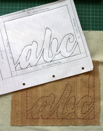
Once the fabric was dry, I fused the fabric to a piece of unbleached cotton for stability and traced the design onto the right side of the fabric using dressmakers’ transfer paper. Because of the weave I also did a quick running stitch along the transfer lines so that they were easier to see. This gave me a boundary as to where I need to FME so that I didn’t waste a lot of effort stitching fabric that was only to be cut out anyway.
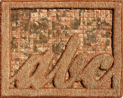
I was having a lot of fun at the sewing machine, and the FME ended up covering pretty much the entire piece and basically creating a completely new fabric. I used a matching top thread and a chocolate bobbin thread and set the bobbin tension a little loose so that I got a ‘peek’ of the bobbin thread now and again.
Once I finished with the FME, I fused the piece to felt and added the backing fabric and machine stitched along my trace lines one more time to ensure stability of the fabric edges. I then cut away the extra fabric (leaving a 1/8-inch margin from the stitch line) and blanket stitched all the edges, using 6-ply floss on the outer edges and 3-ply floss everywhere else. By this point I had decided on the coptic stitch binding and cut off the seam allowance.
After I finished the binding, I decided a little more colour was in order, and stippled several colours of metallic setacolour fabric paint as well as some gold mica. I also stippled the 2nd page of the book to tie in the colours a bit better.
Here’s how it looks finished with the 2nd page behind it. Both pages move independently from one another.
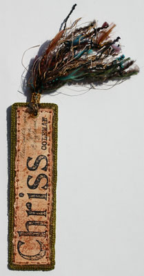
While I was working on all the hand stitching on the cover of my book, I decided I needed to finish something to make me happy, so I fashioned my sign-in tag for my book. I figured with a theme of letters/writing that a bookmark tag would be very appropriate. :)
I fashioned my bookmark with remnants of the fabric I printed for use on the cover and sub-cover, with a felt interior and I used Bondaweb to fuse all the layers together to keep them still and stiff while I handstitched.
First thing, I used various gesso techniques to produce the background on the watercolour paper, stamped a cursive writing image with a copper Brilliance inkpad, tore the paper to size using a ruler as a guide, and chalked the edges with copper Craf-T glimmer chalks
I fused a piece of the printed fabric to a piece of felt and cut to size. I then tacked down the paper with a bit of double-sided tape to keep the paper in place while I hand stitched around the edges of the paper in metallic copper thread with a simple running stitch combined with french knots.
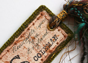
Once my stitching was in place I carefully stamped my name (Ma Vinci stamps ) and handwrote my location.
With all the stitching done on the front, I then fused the fabric for the back of the bookmark to the piece, and trimmed down the fabric to size. I stitched around the entire bookmark in blanket stich using pearl cotton embroidery thread, and I started at the top middle so that my initial stitches would be covered by the tassle.
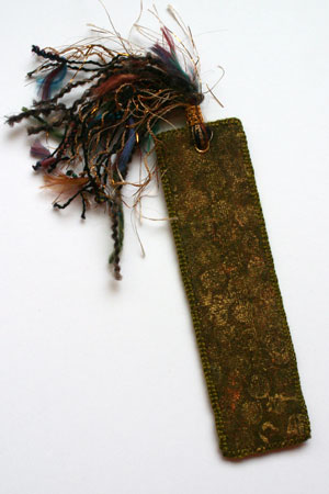
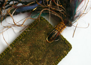
I used a grommet (large eyelet) to create a hole in which to thread my fibres through, and used a Mermaid Tears’ Tassle Tube as a collar for the fibres.
While designing my journal, I knew that I probably wouldn’t be able to stick to just fabric. Of course, since my theme is writing/letters the addition of paper works really well with my theme—so that’s just what I did with the second leaf of my journal.
I used two pieces of the printed fabric that I posted about yesterday as my background for this technique. As it turned out, I probably wasn’t necessary and I could have simply used the fabric in its original form, but since I didn’t know how much distressing I’d do, I decided to use the printed fabrics.
Ingredients:
- Fabric to use as a base
- Adhesive web such as Bondaweb or WonderUnder
- Felt or fleece (I used some cheap felt)
- Text pages from a book, newspaper or magazine
- Tim Holtz Distress Inks in a variety of brown tones (I used Old Paper, Tea Dye and Vintage Photo) or similar colouring agent such as Walnut Ink or Tea and Coffee
- Iron and Sewing Machine
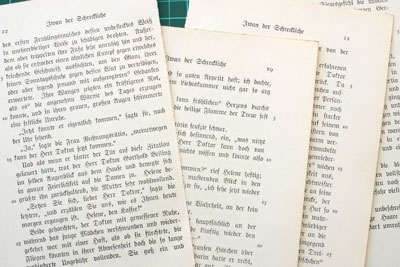
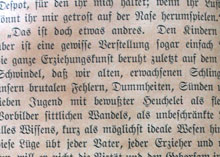
My first step was to distress these papers. I love these. They are from an old German book that is printed in Blackletter that I’m planning to alter.
I used my Distress Ink in Tea Dye and tapped it all over the page (the ink should be visibly wet). I then took a baby wipe and smeared the ink to cover the page. The ink will actually smooth out and dry much lighter than it first appears.
Crumple the papers, taking some caution as to not destroy them, but don’t worry about any small tears as it will just add to the distressed look.
Smooth the pages out slightly and lightly tap some Vintage Photo Distress Ink over the page. Be sure to let the pages dry before preceding to the next step.
While you are waiting for your paper to dry, fuse your fabric to the felt or fleece using the adhesive web according to the package directions. The felt will give the piece a lightly quilted look and help stabilize the fabric while you are sewing.
Once the paper was dry, I cut down my pages so I no longer had a margin around the text and began sewing the vertical lines across the piece essentially quilting the paper to the fabric. Piece the text paper as needed to cover the entire area. Once the entire area is covered, sew perpendicular lines to form a grid. Remember, the grid doesn’t need to be perfect. ;)
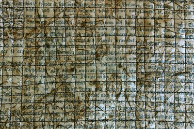
I zigzagged a few random lines on the grid, about 6 in each direction, just to give a bit of effect. Now the fun begins. :) Take the thread and the foot off your sewing maching and turn down the feed dogs and Free Motion Embroider the entire piece—I was sewing with the pedal to the floor and sewing quite tight as if I were doing a granite stitch. The idea is to distress the papers and make them more supple…
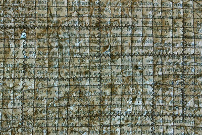
Finally, I scraped across the piece with my fingernails to loosen the paper (you may wish to do this over a bin or outside—definitely don’t do this on a carpet as it creates a lot of mess). Scrape as much or as little as you feel is necessary to create the desired effect. I think lightly inked the papers again with a combination of Old Paper, Vintage Photo, and Tea Dye Distress Inks for a bit more colour.
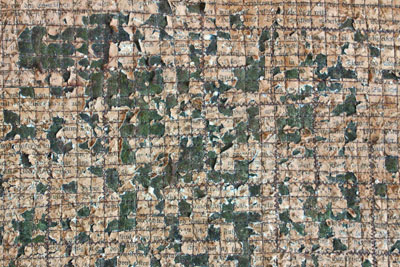
And that’s the top page of the second leaf of my book. Once I finish my sign in page I can sew them back to back and bind the edges.
The inspiration for this piece came from several Maggie Grey Books, including Layers of Stitch (co-written with Valerie Campbell-Harding) and Paper, Metal, Stitch (with Jane Wild). I’ve yet to purchase a Maggie Grey book that I haven’t loved.
My fabric journal is starting to come along nicely, and I thought I’d share it’s progress, and a few techniques along the way. I’ve designed the cover with an openwork front and back cover which shows through to the next page—the ‘inside cover’. This printed fabric will be the back of the openwork cover and the background for the front of the inside cover.
Ingredients:
- Base Fabric
- Fabric Paints (I used Pebeo Setacolour in Chamois, Shimmer light copper and Shimmer Gold)
- Item to print with (I used a sponge, some newspaper, and some bubblewrap)
- An iron
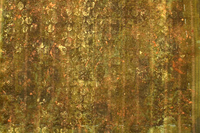
I started with that same commercial fabric I was using for the Puff Paint Experiment. This is it’s unaltered state:
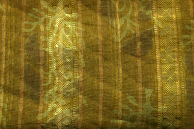
My first task was to ‘muddy it up’ so to speak. Basically, I wanted to take a dark colour in the same family as the fabric (in this instance the Chamois—which is more like a brown) and sponge it across the fabric to obliterate most of the print of the fabric. I used a rather subtle printed fabric to start with, so this task was not difficult.
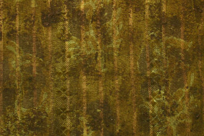
Next, I crumpled up a bit of newsprint and added light touches of the Simmer light copper paint all over the fabric.
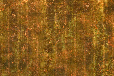
For my final layer of paint, I brayered some of the Simmer Gold onto a piece of bubble wrap and printed that onto the fabric, repeating until I was happy with the results. Anything that can print a bold image will work, I just really happen to like the look of printed bubble wrap.
Now usually you should wait about 12 hours and then fix with an iron according to the instructions, however if you are using a fabric that won’t melt under a heat gun, a couple minutes under the heat gun (always moving the heat gun…. don’t just keep it in one spot) will dry the paint enough that you can iron fix it, always remembering to use a pressing cloth over top.
I printed four of these pieces. Two of them will remain as you see them an become the back side of the front openwork cover. The other two will become the background of the subsequent page, which I’ll post tomorrow. :)